Smooth Wizard Widget for Flutter Apps
Guide users through creating complex data with a smoothly animated wizard.
Thu, October 27 2022

Jake Landers
Developer and Creator
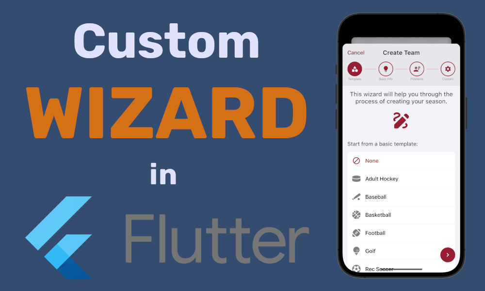
Table of Contents
When building apps there tends to be a case where users need to create a relatively complex piece of data. But, creating a simple to use UI to create said data can be a challenge. This is where wizards come in. Everyone exploring the web has encountered these wizards when creating accounts, entering payment details, etc. I decided to create my own wizard wrapper that I use in my Crosscheck Sports App multiple times, for creating teams, seasons, events, and polls.
Project Setup
This project will have one required package, provider, for state management, and one optional package, sprung, for spring-like curves.
1dependencies:
2  flutter:
3    sdk: flutter
4  provider: ^6.0.4
5  sprung: ^3.0.1
6
Model
We will use a change notifier class to handle the form state for our wizard. This will be held in a class WizardModel. This class will handle all of the PageView state used later in the view, which is controlled with a PageController.
1class WizardModel extends ChangeNotifier {
2  late int _index;
3  late int numPages;
4  late PageController controller;
5  late Duration duration;
6  late Curve curve;
7
8  WizardModel({
9    required this.numPages,
10    int initialPage = 0,
11    required this.duration,
12    required this.curve,
13  }) {
14    controller = PageController(initialPage: initialPage);
15    setIndex(initialPage);
16  }
17}
18
model.dart
Model Methods
This class will also host some methods to allow consumers of the provider access to changing pages. This will include getPage(), setIndex(), setPage(), nextPage(), previousPage(), and isAtEnd().
1  /// get the current index
2  int getPage() {
3    return _index;
4  }
5
6  /// set the current index
7  void setIndex(index) {
8    _index = index;
9    notifyListeners();
10  }
11
12  /// set the current page
13  void setPage(int index) {
14    controller.animateToPage(
15      index,
16      duration: duration,
17      curve: curve,
18    );
19    notifyListeners();
20  }
21
22  /// navigate to the next page
23  void nextPage() {
24    controller.nextPage(
25      duration: duration,
26      curve: curve,
27    );
28    notifyListeners();
29  }
30
31  /// navigate to the previous page
32  void previousPage() {
33    controller.previousPage(
34      duration: duration,
35      curve: curve,
36    );
37    notifyListeners();
38  }
39
40  /// whether the user is at the end of the wizard or not
41  bool isAtEnd() {
42    return _index == numPages - 1;
43  }
44
model.dart
Wizard Item
We need a way for us to pass the views we want to present inside this model in an easy to understand and consume way. Each page needs a title, an icon, and a child. So logically, we will create a class to hold this data.
1class WizardItem {
2  final String title;
3  final IconData icon;
4  final Widget child;
5
6  WizardItem({
7    required this.title,
8    required this.icon,
9    required this.child,
10  });
11}
12
model.dart
View
Now onto the meat of the project. Let's break down the view into easy to digest components that we can later combine together to create the full wizard.
Wizard View
The wizard view is going to be a stateless widget with some various parameters to allow for customization of some aspects of the view. Here is the constructor for this view:
1const Wizard({
2  super.key,
3  required this.pages,
4  required this.onComplete,
5  this.duration = const Duration(milliseconds: 500),
6  this.curve = Curves.easeInOut,
7  this.accentColor = Colors.blue,
8  this.initialPage = 0,
9});
10final List<WizardItem> pages;
11final VoidCallback onComplete;
12final Duration duration;
13final Curve curve;
14final Color accentColor;
15final int initialPage;
16
wizard.dart
Accessing the Provider
The very first thing we need to do with this view is consume the provider. We can do this in our build() method. We use the builder() method to get access to the provider in the rest of the widget.
1 2Widget build(BuildContext context) { 3 return ChangeNotifierProvider<WizardModel>( 4 create: (_) => WizardModel( 5 numPages: pages.length, 6 duration: duration, 7 curve: curve, 8 initialPage: initialPage, 9 ), 10 // we use `builder` to obtain a new `BuildContext` that has access to the provider 11 builder: (context, child) { 12 // No longer throws 13 return _body(context); 14 }, 15 ); 16} 17
wizard.dart
Navigation
The first component we need to create is the header. This contains a list of these cell-like items that show a page's title and icon.
Each cell will need to be clickable and navigate to the corresponding page. Also, the cells should be highlighted when the current page is equal to or less than the items page index. Here is the code for a cell:
1Widget _cell(
2    BuildContext context, WizardModel model, int index, WizardItem item) {
3  return CupertinoButton(
4    padding: EdgeInsets.zero,
5    minSize: 0,
6    borderRadius: BorderRadius.zero,
7    onPressed: () {
8      model.setPage(index);
9    },
10    child: Column(
11      children: [
12        Stack(
13          alignment: Alignment.center,
14          children: [
15            Container(
16              height: MediaQuery.of(context).size.width / 8,
17              width: MediaQuery.of(context).size.width / 8,
18              decoration: BoxDecoration(
19                border: Border.all(
20                  width: 2,
21                  color: index == model.getPage()
22                      ? Colors.transparent
23                      : widget.accentColor,
24                ),
25                color: index > model.getPage()
26                    ? Colors.transparent
27                    : widget.accentColor,
28                shape: BoxShape.circle,
29              ),
30            ),
31            Icon(item.icon,
32                color: index > model.getPage()
33                    ? widget.accentColor
34                    : Colors.white),
35          ],
36        ),
37        const SizedBox(height: 3),
38        Text(
39          item.title,
40          style: TextStyle(
41            fontSize: 11,
42            fontWeight: FontWeight.w300,
43            color: _textColor(context).withOpacity(0.5),
44          ),
45        ),
46      ],
47    ),
48  );
49}
50
wizard.dart
Putting the header together is easy, as all we need to make sure is the items are in a row, and then we can apply the Row modifier mainAxisAlignment: MainAxisAlignment.spaceAround to make sure the cells space themselves accordingly. We also need to take into account the user's device safe area, and add some extra padding on the top so the wizard looks proper on devices with no safe area.
1return SafeArea(
2  top: true,
3  left: false,
4  right: false,
5  bottom: false,
6  child: Padding(
7    padding: const EdgeInsets.only(top: 10.0),
8    child: Row(
9      mainAxisAlignment: MainAxisAlignment.spaceAround,
10      children: [
11        for (var i = 0; i < widget.pages.length; i++)
12          _cell(context, model, i, widget.pages[i]),
13      ],
14    ),
15  ),
16);
17
wizard.dart
Action Buttons
In this wizard I have also provided some buttons on the bottom that let the user choose whether they want to swipe between the views or tap buttons. When the user gets to the end of the wizard, the right-most button expanded into an action button the user can tap to complete the wizard. This button accesses the onComplete() method the user passes into the wizard.
1Widget _actions(BuildContext context, WizardModel model) {
2    return SafeArea(
3      child: Padding(
4        padding: EdgeInsets.fromLTRB(
5            16, 0, 16, MediaQuery.of(context).padding.bottom == 0 ? 10 : 0),
6        child: Row(
7          children: [
8            AnimatedOpacity(
9              opacity: model.getPage() == 0 ? 0 : 1,
10              duration: const Duration(milliseconds: 300),
11              child: CupertinoButton(
12                padding: EdgeInsets.zero,
13                minSize: 0,
14                borderRadius: BorderRadius.zero,
15                onPressed: () {
16                  if (model.getPage() != 0) {
17                    model.previousPage();
18                  }
19                },
20                child: Container(
21                  height: 50,
22                  width: 50,
23                  decoration: BoxDecoration(
24                    shape: BoxShape.circle,
25                    color: _textColor(context).withOpacity(0.1),
26                  ),
27                  child: Icon(
28                    Icons.chevron_left,
29                    color: _textColor(context).withOpacity(0.7),
30                  ),
31                ),
32              ),
33            ),
34            const Spacer(),
35            CupertinoButton(
36              padding: EdgeInsets.zero,
37              minSize: 0,
38              borderRadius: BorderRadius.zero,
39              child: ClipRRect(
40                borderRadius: BorderRadius.circular(25),
41                child: BackdropFilter(
42                  filter: ImageFilter.blur(
43                    sigmaX: 5,
44                    sigmaY: 5,
45                  ),
46                  child: AnimatedContainer(
47                    duration: duration,
48                    curve: curve,
49                    decoration: BoxDecoration(
50                      color: accentColor,
51                      borderRadius: BorderRadius.circular(25),
52                    ),
53                    width: model.isAtEnd()
54                        ? MediaQuery.of(context).size.width / 1.8
55                        : 50,
56                    height: 50,
57                    child: model.isAtEnd()
58                        ? const Center(
59                            child: Text(
60                              "Complete",
61                              softWrap: false,
62                              style: TextStyle(
63                                fontWeight: FontWeight.w500,
64                                fontSize: 16,
65                                color: Colors.white,
66                              ),
67                            ),
68                          )
69                        : const Icon(
70                            Icons.chevron_right,
71                            color: Colors.white,
72                          ),
73                  ),
74                ),
75              ),
76              onPressed: () {
77                if (model.isAtEnd()) {
78                  onComplete();
79                } else {
80                  model.nextPage();
81                }
82              },
83            ),
84          ],
85        ),
86      ),
87    );
88  }
89
wizard.dart
Content
Now, we can create an object to hold the content that the user passed into the widget. We need to use a PageView to gain access to the smooth scrolling between the views, and to consume the controller the model provides. There are a few things we need to consider here.
First, we need to use a Stack to place the action buttons on top of the rest of the views. Second, the navigation needs to be wrapped in a container to give it a distinct background color. Second, The PageView needs to be wrapped in an Expanded when used in a Column. Lastly, we need to set the onPageChanged() method in the PageView to update the model's index whenever the page changes.
1Widget _body(BuildContext context) {
2  WizardModel model = Provider.of<WizardModel>(context);
3  return Container(
4    color: _backgroundColor(context),
5    child: Stack(
6      alignment: Alignment.bottomCenter,
7      children: [
8        _content(context, model),
9        _actions(context, model),
10      ],
11    ),
12  );
13}
14
15Widget _content(BuildContext context, WizardModel model) {
16  return Column(
17    children: [
18      Container(
19        color: _textColor(context).withOpacity(0.05),
20        child: Column(children: [
21          _navigation(context, model),
22          const SizedBox(height: 16),
23        ]),
24      ),
25      Expanded(
26        child: PageView(
27          controller: model.controller,
28          children: [
29            for (var i in pages) i.child,
30          ],
31          onPageChanged: (page) {
32            model.setIndex(page);
33          },
34        ),
35      ),
36    ],
37  );
38}
39
wizard.dart
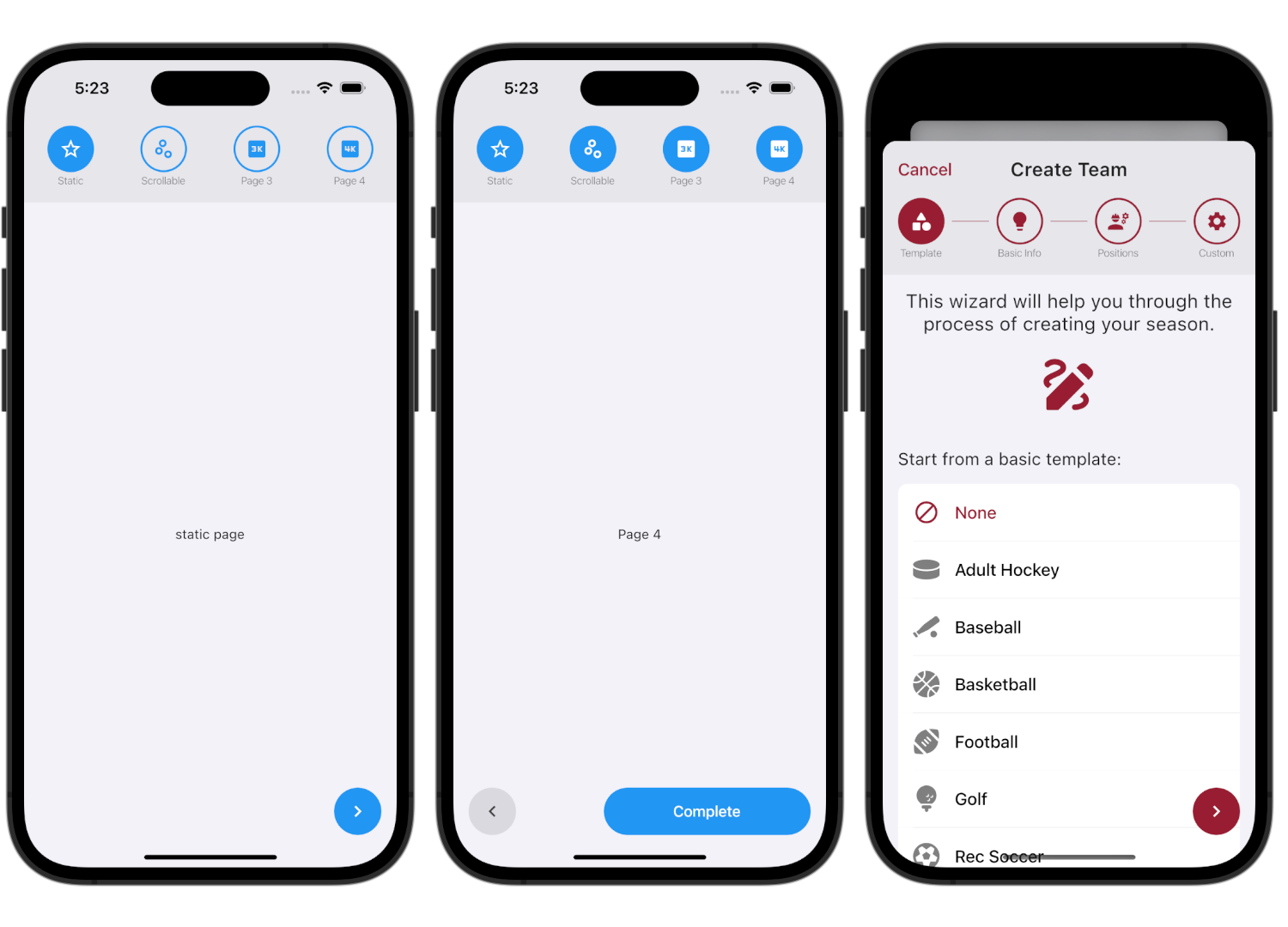
Using the Wizard
To use this new wizard, all we need to pass in is a list of WizardItem and an action! We can also pass in a curve, duration, accentColor, and initialPage.
1Wizard(
2  curve: Sprung.overDamped,
3  duration: const Duration(milliseconds: 700),
4  onComplete: () {},
5  pages: [
6    WizardItem(
7      title: "Static",
8      icon: Icons.star_outline,
9      child: const Center(
10        child: Text("static page"),
11      ),
12    ),
13    WizardItem(
14      title: "Scrollable",
15      icon: Icons.scatter_plot_outlined,
16      child: ListView(
17        padding: EdgeInsets.zero,
18        children: [
19          Padding(
20            padding: const EdgeInsets.all(8.0),
21            child: Container(
22              color: Colors.grey,
23              child: const SizedBox(
24                height: 1000,
25                width: double.infinity,
26              ),
27            ),
28          ),
29        ],
30      ),
31    ),
32    WizardItem(
33      title: "Page 3",
34      icon: Icons.three_k,
35      child: const Center(
36        child: Text("Page 3"),
37      ),
38    ),
39    WizardItem(
40      title: "Page 4",
41      icon: Icons.four_k,
42      child: const Center(
43        child: Text("Page 4"),
44      ),
45    ),
46  ],
47),
48