Swift vs Flutter - LoginUI
I built the same screen in both Flutter and SwiftUI to compare and contrast them against each other
Sun, July 24 2022

Jake Landers
Developer and Creator
Table of Contents
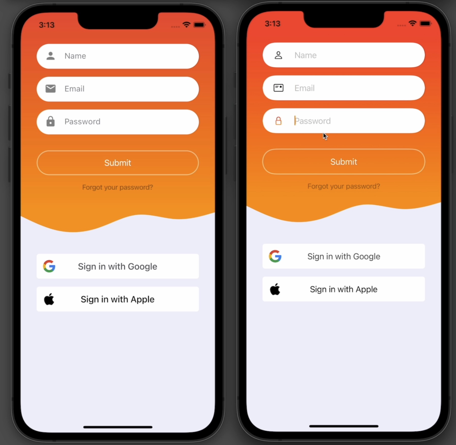
Final Product
Flutter is a great platform for building complex and elegant UI that compiles to many platforms. But, sometimes a native solution can allow for greater functionality. for example, building apps for macOS in SwiftUI just looks and feels better.
As a challenge, I decided to build the same login UI with both Flutter and SwiftUI to compile to iPhone, Android, iPad, and macOS.
I will lay this out in a side by side comparison so that the two frameworks can be directly compared in functionality and syntax.
Assets
The needed assets can be found here.
Both projects will use apple.png and google.png, but because SwiftUI does not support packages out of the box, SwiftUI will utilize wave.png and Flutter will use wave.svg.
In Flutter, you will also have to add this into your <code>pubspec.yaml</code> file.
1assets:
2  - assets/svg/wave.svg
3  - assets/images/google.png
4  - assets/images/apple.png
5
Global Setup
There are some global varialbes and extensions that are needed for functionality of the app.
Swift
For SwiftUI, we need to define some colors and extensions to handle hiding the keyboard along with removing a focus ring around text fields.
1// static colors
2fileprivate func backgroundColor(colorScheme: ColorScheme) -> Color {
3    return colorScheme == .light ? Color(.sRGB, red: 240/255, green: 240/255, blue: 250/255, opacity: 1) : Color(.sRGB, red: 40/255, green: 40/255, blue: 40/255, opacity: 1)
4}
5
6fileprivate func textColor(colorScheme: ColorScheme) -> Color {
7    return colorScheme == .light ? Color.black : Color.white
8}
9
10fileprivate func cellColor(colorScheme: ColorScheme) -> Color {
11    return colorScheme == .light ? Color.white : Color(.sRGB, red: 80/255, green: 80/255, blue: 80/255, opacity: 1)
12}
13
14extension View {
15    func hideKeyboard() {
16        #if canImport(UIKit)
17        // hide keyboard on iOS devices
18        UIApplication.shared.sendAction(#selector(UIResponder.resignFirstResponder), to: nil, from: nil, for: nil)
19        #elseif os(macOS)
20        // hide keyboard on macOS
21        NSApp.keyWindow?.makeFirstResponder(nil)
22        #endif
23        // do nothing on any other device
24    }
25}
26
27#if os(macOS)
28// remove ring around NSTextFields on MacOS
29extension NSTextField {
30    open override var focusRingType: NSFocusRingType {
31        get { .none }
32        set { }
33    }
34}
35#endif
36
Flutter
Flutter is a little simpler, as we only need to define the colors.
1Color _cellColor(BuildContext context) {
2  return MediaQuery.of(context).platformBrightness == Brightness.light
3      ? Colors.white
4      : const Color.fromRGBO(80, 80, 80, 1);
5}
6
7Color _backgroundColor(BuildContext context) {
8  return MediaQuery.of(context).platformBrightness == Brightness.light
9      ? const Color.fromRGBO(240, 240, 250, 1)
10      : const Color.fromRGBO(40, 40, 40, 1);
11}
12
13Color _textColor(BuildContext context) {
14  return MediaQuery.of(context).platformBrightness == Brightness.light
15      ? const Color.fromRGBO(15, 15, 25, 1)
16      : const Color.fromRGBO(240, 240, 250, 1);
17}
18
View Setup
View set up on both platforms is fairly similar, but there are some key differences. SwiftUI uses the <code>View</code> protocol, and Flutter uses <code>Stateful</code> widgets.
SwiftUI
For Swift, we are going to use an <code>ObservableObject</code> class to handle our state. Then, we can define our colors and fields there. Then in our view, we can use a <code>FocusState</code> to control what field we are currently editing, and handle keyboard actions.
1class LoginModel: ObservableObject {
2    @Published var name = ""
3    @Published var email = ""
4    @Published var password = ""
5
6    let color1 = Color.red
7    let color2 = Color.orange
8
9    func onSubmit() {
10        print("submitted ...")
11    }
12
13    func forgotPassword() {
14        print("forgot password ...")
15    }
16}
17
18struct LoginUI: View {
19    @Environment(\.colorScheme) var colorScheme
20
21    @StateObject var model = LoginModel()
22
23    @FocusState var focused: Field?
24
25    // available text fields
26    enum Field {
27        case name
28        case email
29        case password
30    }
31}
32
Flutter
For Flutter, we can define the two colors we need as params on the class. Then, instead of using a package like <code>Provider</code>, we can just handle state inside the class with basic fields.
1class LoginUI extends StatefulWidget { 2 const LoginUI({ 3 Key? key, 4 this.color1 = Colors.orange, 5 this.color2 = Colors.red, 6 }) : super(key: key); 7 final Color color1; 8 final Color color2; 9 10 11 _LoginUIState createState() => _LoginUIState(); 12} 13 14class _LoginUIState extends State<LoginUI> { 15 String _name = ""; 16 String _email = ""; 17 String _password = ""; 18} 19
Text Field
Swift
In Swift we are going to use a new view to define our text fields. This will take a number of parameters:
1struct FieldWrapper: View {
2    @Environment(\.colorScheme) var colorScheme
3
4    @Binding var field: String
5    var isFocused: Bool
6    let label: String
7    let icon: String
8    var obscure = false
9    var color1 = Color.blue
10    var color2 = Color.green
11
12    var body: some View {}
13}
14
Then, inside the view we can control certain aspects of the view. We can highlight the icon when the field is focused, and show a <code>SecureField</code> when a password input is needed.
1var body: some View {
2    HStack(spacing: 16) {
3        // show highlighted icon when field is actively being edited
4        if isFocused {
5            LinearGradient(gradient: Gradient(colors: [color1, color2]), startPoint: .top, endPoint: .bottom)
6                .mask(Image(systemName: icon))
7                .frame(width: 32)
8        } else {
9            Image(systemName: icon)
10                .frame(width: 32)
11        }
12        // show obscure text field when specified
13        if obscure {
14            SecureField(label, text: $field)
15                .textFieldStyle(PlainTextFieldStyle())
16        } else {
17            TextField(label, text: $field)
18                .textFieldStyle(PlainTextFieldStyle())
19        }
20    }
21    .accentColor(color2)    // text line color
22    .padding(16)
23    .frame(height: 50)
24    .background(cellColor(colorScheme: colorScheme))
25    .clipShape(RoundedRectangle(cornerRadius: 25, style: .continuous))
26}
27
Flutter
In Flutter, we again take a different approach. We can specify a function inside the class that returns a <code>Widget</code>. There is some extra boilerplate that needs to be written to remove all styling from the <code>TextFormField</code>. But in return, later we can easily specify what color everything becomes when the field is highlighed. Also, instead of using a <code>@Published</code> value to auto update state, we specify a function that returns whatever is typed into the field.
1Widget _field(BuildContext context, String label, IconData icon,
2    Function(String) onChanged,
3    {bool obscure = false}) {
4  return Material(
5    color: _cellColor(context),
6    shape: RoundedRectangleBorder(borderRadius: BorderRadius.circular(25)),
7    // remove shadow
8    elevation: 0,
9    child: SizedBox(
10      height: 50,
11      width: double.infinity,
12      child: Padding(
13        padding: const EdgeInsets.symmetric(horizontal: 16.0),
14        child: TextFormField(
15          onChanged: (value) => onChanged(value),
16          obscureText: obscure,
17          style: TextStyle(
18            color: _textColor(context),
19          ),
20          decoration: InputDecoration(
21            icon: Icon(icon),
22            hintText: label,
23
24            hintStyle: TextStyle(color: _textColor(context).withOpacity(0.5)),
25            // to remove the underline on the field
26            enabledBorder: const UnderlineInputBorder(
27              borderSide: BorderSide(color: Colors.transparent),
28            ),
29          ),
30        ),
31      ),
32    ),
33  );
34}
35
Fields View
The fieldsView is similar for both platforms, with SwiftUI utilizing the view modifier <code>.onSubmit</code> to change the field focus when the action button is hit on the keyboard
Swift
1private var fields: some View {
2    VStack(spacing: 16) {
3        // name field
4        FieldWrapper(field: $model.name, isFocused: focused == .name, label: "Name", icon: "person", color1: model.color1, color2: model.color2)
5            .focused($focused, equals: .name)
6            .submitLabel(.next)
7        // if on iOS, show a different keyboard
8        #if canImport(UIKit)
9            .textContentType(.givenName)
10        #endif
11        // email field
12        FieldWrapper(field: $model.email, isFocused: focused == .email, label: "Email", icon: "mail", color1: model.color1, color2: model.color2)
13            .focused($focused, equals: .email)
14            .submitLabel(.next)
15        // if on iOS, show a different keyboard
16        #if canImport(UIKit)
17            .textContentType(.emailAddress)
18        #endif
19        // password field
20        FieldWrapper(field: $model.password, isFocused: focused == .password, label: "Password", icon: "lock", obscure: true, color1: model.color1, color2: model.color2)
21            .focused($focused, equals: .password)
22            .textContentType(.password)
23            .submitLabel(.go)
24        // login button
25        Button(action: {
26            model.onSubmit()
27        }) {
28            Text("Submit")
29                .foregroundColor(Color.white)
30                .frame(height: 50)
31                .frame(maxWidth: .infinity)
32                .background(Color.white.opacity(0.0001))    // to make entire button clickable
33                .overlay(
34                    // add a white border around button
35                    RoundedRectangle(cornerRadius: 25, style: .continuous)
36                        .stroke(Color.white.opacity(0.5), lineWidth: 2)
37                )
38        }
39        .buttonStyle(PlainButtonStyle())
40        .padding(.top, 16)
41        Button(action: {
42            model.forgotPassword()
43        }) {
44            Text("Forgot your password?")
45                .foregroundColor(Color.black)
46                .opacity(0.5)
47                .font(.system(size: 14, weight: .light))
48        }
49        .buttonStyle(PlainButtonStyle())
50    }
51    .onSubmit {
52        // when defined submit key is clicked, perform a different action
53        switch focused {
54        case .name:
55            focused = .email
56        case .email:
57            focused = .password
58        default:
59            // login code here
60            model.onSubmit()
61        }
62    }
63}
64
Flutter
1Widget _fields(BuildContext context) {
2  return Column(
3    children: [
4      // name
5      _field(context, "Name", Icons.person, (p0) {
6        setState(() {
7          _name = p0;
8        });
9      }),
10      const SizedBox(height: 16),
11      // email
12      _field(context, "Email", Icons.mail, (p0) {
13        setState(() {
14          _email = p0;
15        });
16      }),
17      const SizedBox(height: 16),
18      // password
19      _field(context, "Password", Icons.lock, (p0) {
20        setState(() {
21          _password = p0;
22        });
23      }, obscure: true),
24      const SizedBox(height: 16)
25      CupertinoButton(
26        // first 4 params to remove all styling on the button and just make
27        // it behave as an inkwell that gets an opacity when clicked
28        color: Colors.transparent,
29        disabledColor: Colors.transparent,
30        padding: const EdgeInsets.all(0),
31        minSize: 0,
32        child: Container(
33          decoration: BoxDecoration(
34            borderRadius: BorderRadius.circular(25),
35            border: Border.all(color: Colors.white.withOpacity(0.5), width: 2),
36            color: Colors.transparent,
37          ),
38          height: 50,
39          width: double.infinity,
40          child: const Center(
41            child: Text(
42              "Submit",
43              style: TextStyle(color: Colors.white),
44            ),
45          ),
46        ),
47        onPressed: () {
48          //
49        },
50      ),
51    ],
52  );
53}
54
Host
Now, we need a host to hold the field view. Both platforms have a sililar approach. Wrap the field view in a container that has a <code>LinearGradient</code> as the background, then the <code>wave</code> image is below this view, with a spacer pushing everything to the top.
Swift
// In SwiftUI, we can add the <code>.onTapGesture</code> to detect when the user taps the screen to dismiss the keyboard.
1var body: some View {
2    VStack(spacing: 0) {
3        // all fields with background of a linear gradient to allow for dynamic sizing before wave
4        fields
5            .padding(32)
6            .background(LinearGradient(gradient: Gradient(colors: [model.color1, model.color2]), startPoint: .top, endPoint: .bottom))
7            .ignoresSafeArea(.keyboard)
8        // wave with same color as bottom of gradient to blend
9        Image("wave")
10            .renderingMode(.template)
11            .resizable()
12            .foregroundColor(model.color2)
13            .frame(height: 100)
14        // space from bottom of screen
15        Spacer(minLength: 0)
16    }
17    .frame(maxWidth: .infinity, maxHeight: .infinity)
18    .background(backgroundColor(colorScheme: colorScheme))
19    .onTapGesture {
20        // hide keyboard on tap
21        hideKeyboard()
22    }
23}
24
Flutter
In flutter, we can wrap the entire view in a <code>GestureDetector</code> in order to hide the keyboard whenever the user taps the screen.
1 2Widget build(BuildContext context) { 3 return GestureDetector( 4 onTap: () { 5 // for dismissing keybaord when tapping on the screen 6 if (WidgetsBinding.instance != null) { 7 WidgetsBinding.instance!.focusManager.primaryFocus?.unfocus(); 8 } 9 }, 10 child: _body(context), 11 ); 12} 13 14Widget _body(BuildContext context) { 15 return Theme( 16 // to remove the border on the field 17 data: Theme.of(context).copyWith( 18 colorScheme: ThemeData().colorScheme.copyWith(primary: widget.color1), 19 inputDecorationTheme: const InputDecorationTheme( 20 focusedBorder: UnderlineInputBorder( 21 borderSide: BorderSide( 22 style: BorderStyle.solid, 23 color: Colors.transparent, 24 ), 25 ), 26 ), 27 ), 28 child: Scaffold( 29 backgroundColor: _backgroundColor(context), 30 resizeToAvoidBottomInset: false, 31 body: _form(context), 32 ), 33 ); 34} 35 36Widget _form(BuildContext context) { 37 return Column( 38 children: [ 39 // dynamic size background with fields 40 Container( 41 width: double.infinity, 42 decoration: BoxDecoration( 43 gradient: LinearGradient( 44 colors: [ 45 widget.color1, 46 widget.color2, 47 ], 48 begin: Alignment.bottomCenter, 49 end: Alignment.topCenter, 50 ), 51 ), 52 child: SafeArea( 53 child: Padding( 54 padding: const EdgeInsets.fromLTRB(32, 16, 32, 0), 55 child: Column( 56 children: [ 57 // all fields 58 _fields(context), 59 const SizedBox(height: 16), 60 // forgot password 61 CupertinoButton( 62 // first 4 params to remove all styling on the button and just make 63 // it behave as an inkwell that gets an opacity when clicked 64 color: Colors.transparent, 65 disabledColor: Colors.transparent, 66 padding: const EdgeInsets.all(0), 67 minSize: 0, 68 child: Text( 69 "Forgot your password?", 70 style: TextStyle( 71 color: _textColor(context).withOpacity(0.5), 72 fontSize: 14, 73 fontWeight: FontWeight.w400, 74 ), 75 ), 76 onPressed: () {}, 77 ), 78 ], 79 ), 80 ), 81 ), 82 ), 83 // save svg for transition 84 SizedBox( 85 width: double.infinity, 86 child: SvgPicture.asset( 87 "assets/svg/wave.svg", 88 color: widget.color1, 89 fit: BoxFit.fill, 90 width: double.infinity, 91 height: MediaQuery.of(context).size.height * 0.1, 92 semanticsLabel: 'Wave', 93 ), 94 ), 95 ], 96 ); 97} 98
Sign In Buttons
For an added flare, I decided to create my own Sign in with X buttons. This view code is very similar for both. THe Flutter code is written a little less optimized, and a more similar approach to SwiftUI could be used.
Swift
There is some extra code used to stack the buttons on iOS and present them side by side on macOS
1#if os(macOS)
2// show HStack sign in buttons on macOS
3private var signInButtons: some View {
4    HStack(spacing: 16) {
5        // google
6        googleButton
7        // apple
8        appleButton
9    }
10    .padding(.horizontal, 32)
11}
12#else
13// show VStack sign in buttons on every other platform
14private var signInButtons: some View {
15    VStack(spacing: 16) {
16        // google
17        googleButton
18        // apple
19        appleButton
20    }
21    .padding(.horizontal, 32)
22}
23#endif
24
25private var googleButton: some View {
26    Button(action: {
27        print("sign in with google")
28    }) {
29        signInButtonHelper(image: "google", label: "Sign in with Google", labelColor: (colorScheme == .light ? Color.black : Color.white).opacity(0.7), imageBg: colorScheme == .light ? Color.clear : Color.white, cellBg: colorScheme == .light ? Color.white : Color(.sRGB, red: 66/255, green: 133/255, blue: 244/255, opacity: 1))
30    }
31    .buttonStyle(PlainButtonStyle())
32}
33
34private var appleButton: some View {
35    Button(action: {
36        print("sing in with apple")
37    }) {
38        signInButtonHelper(image: "apple", label: "Sign in with Apple", labelColor: Color.black, imageBg: Color.clear, cellBg: Color.white)
39    }
40    .buttonStyle(PlainButtonStyle())
41}
42
43// wrapper for sign in buttons to help with code reusability
44private func signInButtonHelper(image: String, label: String, labelColor: Color, imageBg: Color, cellBg: Color) -> some View {
45    return ZStack(alignment: .center) {
46        // logo
47        HStack {
48            ZStack {
49                RoundedRectangle(cornerRadius: 5, style: .continuous)
50                    .fill(imageBg)
51                Image(image)
52                    .resizable()
53                    .frame(width: 25, height: 25)
54            }
55            .frame(width: 40, height: 40)
56            Spacer()
57        }
58        .padding(.leading, 5)
59        // text
60        Text(label)
61            .foregroundColor(labelColor)
62    }
63    .frame(height: 50)
64    .frame(maxWidth: .infinity)
65    .background(cellBg)
66    .clipShape(RoundedRectangle(cornerRadius: 5, style: .continuous))
67}
68
Flutter
1Widget _signInButtons(BuildContext context) {
2  return Column(
3    children: [
4      // google
5      CupertinoButton(
6        onPressed: () {},
7        color: Colors.transparent,
8        disabledColor: Colors.transparent,
9        padding: const EdgeInsets.all(0),
10        minSize: 0,
11        child: Container(
12          height: 50,
13          width: double.infinity,
14          decoration: BoxDecoration(
15            borderRadius: BorderRadius.circular(5),
16            color:
17                MediaQuery.of(context).platformBrightness == Brightness.light
18                    ? Colors.white
19                    : const Color.fromRGBO(66, 133, 244, 1),
20          ),
21          child: Padding(
22            padding: const EdgeInsets.all(5),
23            child: Stack(
24              children: [
25                // icon
26                Align(
27                  alignment: Alignment.centerLeft,
28                  child: Container(
29                    height: 40,
30                    width: 40,
31                    decoration: BoxDecoration(
32                      borderRadius: BorderRadius.circular(5),
33                      color: Colors.white,
34                    ),
35                    child: Center(
36                      child: Image.asset(
37                        "assets/images/google.png",
38                        height: 25,
39                        width: 25,
40                      ),
41                    ),
42                  ),
43                ),
44                // text
45                Align(
46                  alignment: Alignment.center,
47                  child: Text(
48                    "Sign in with Google",
49                    style: TextStyle(
50                      color: _textColor(context).withOpacity(0.7),
51                      fontWeight: FontWeight.w500,
52                      fontSize: 18,
53                    ),
54                  ),
55                ),
56              ],
57            ),
58          ),
59        ),
60      ),
61      const SizedBox(height: 16),
62      // apple
63      CupertinoButton(
64        onPressed: () {},
65        color: Colors.transparent,
66        disabledColor: Colors.transparent,
67        padding: const EdgeInsets.all(0),
68        minSize: 0,
69        child: Container(
70          height: 50,
71          width: double.infinity,
72          decoration: BoxDecoration(
73            borderRadius: BorderRadius.circular(5),
74            color: Colors.white,
75          ),
76          child: Padding(
77            padding: const EdgeInsets.all(5),
78            child: Stack(
79              children: [
80                // icon
81                Align(
82                  alignment: Alignment.centerLeft,
83                  child: SizedBox(
84                    height: 40,
85                    width: 40,
86                    child: Center(
87                      child: Image.asset(
88                        "assets/images/apple.png",
89                        height: 25,
90                        width: 25,
91                      ),
92                    ),
93                  ),
94                ),
95                // text
96                const Align(
97                  alignment: Alignment.center,
98                  child: Text(
99                    "Sign in with Apple",
100                    style: TextStyle(
101                      color: Colors.black,
102                      fontWeight: FontWeight.w500,
103                      fontSize: 18,
104                    ),
105                  ),
106                ),
107              ],
108            ),
109          ),
110        ),
111      ),
112    ],
113  );
114}
115
Then, you just need to add those buttons to the bottom of the view above the <code>Spacer</code>, then your view is done!
This was an interesting dive into seeing what can be accomplished by both platforms, and you can see that the look is very similar.
Swift line number: 280 Flutter line number: 348